

Shades of blue are the perfect hue for the sky. The contrast between dark and light green easily pours over a picture of a meadow. An open field displays hints of pink, yellow, and lavender.
What a wonderful thing to exist. This is the beauty of color, and when it comes to concepts such as graphics, colors matter more than you may think.
Color graphics in branding, commercial photography, and product placements can make or break an image.
Colors have been known to evoke certain feelings and emotions. Different colors can bring different meanings to people. For example, red can stimulate appetite, whereas blue can be calming.
As a business owner or marketer, you want to choose colors that will evoke the right feelings to achieve the desired response from your target audience. To ensure your color graphics convey the right message, let’s examine why the colors you pick for your graphics matter.
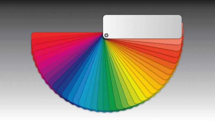
Color Theory in Graphic Design
There is a lot that goes into color theory. Color theory is the science and art of using color. It combines both objective principles and subjective responses to color.
The three main properties of color are hue, value, and chroma. When combined, these three properties create what is called a Color Triangle. Each property has a different effect on how we perceive color.
Hue is the name of a color on the visible spectrum. For example, red, yellow, and blue are hues. Value refers to the lightness or darkness of a hue.
Chroma is the intensity or saturation of a hue. A low-chroma color would be muted, while a high-chroma color would be bright. Now that we know the basics of color theory in graphic design let’s examine why the colors you pick for your graphics matter.
The Effects of Color in Graphics
The colors you pick for your graphic will fall along the Color Triangle. Depending on where the colors fall within the triangle will produce different effects. Let’s look at some examples.
Red: Red is typically associated with energy, passion, power, love, and danger. Red can also increase heart rate and raise blood pressure.
Orange: Orange represents joy, happiness, creativity, determination, and success. Orange also stimulates appetite, which is why it is often used in advertising or commercial photography in the restaurant sector.
Yellow: Yellow can represent happiness, optimism, intellect, and energy. Too much yellow can produce feelings of anxiety. It is crucial to use yellow sparingly in graphics intended to calm or relax viewers, such as those in healthcare settings.
Green: Green is associated with nature, the environment, health, relaxation, and peace. Green also has connotations of wealth and prosperity which makes it ideal for financial institutions or luxury brands.
Blue: Blue is associated with trustworthiness, dependability, tranquility, and serenity. Blue produces calming effects, making it ideal for healthcare graphics or ads targeting seniors.
Purple: Purple is associated with royalty, magic, mystery, and imagination. It also communicates creativity, wisdom, dignity, independence, success, power, and fame. While purple represents a magnitude of great attributes, it can be hard to read on-screen. That’s why you should use it wisely in digital graphics.
The Impact of Color in Marketing
Humans are visual creatures and constantly take in information through our eyes. In fact, 90% of the information that comes into our brains is visual. A significant percentage of how we process information is related to color.
Not only do we pay attention to colors, but they also affect how we feel. It has been proven that colors can influence our moods, feelings, and emotions. Different cultures also associate different meanings with colors.
So, when choosing color graphics, it is essential to consider the responses you want to elicit from your target audience and the cultural context.
Choosing the Right Colors for Your Graphics
Color can help make your graphics more memorable. If people remember what a graphic looks like, they are more likely to act on it. That’s why it’s so important to choose the right colors.
There are two main points to consider when creating a color palette for your graphic design.
The first step is choosing the right hues (or shades) of each color group (i.e., warm vs cool). This includes both primary and tertiary colors and their tints and shades. The second step is choosing complementary hues from within each color group, so they work well together.
The purpose of color is to highlight specific marketing material elements and convey the proper message. You do this by choosing the right colors and creating something visually appealing to represent that message.
Using Color Graphics Effectively
There are a few things to keep in mind when you want to use color graphics effectively in your design.
One of the first things to consider is using only one or two dominant colors per graphic, so viewers’ eyes don’t get overwhelmed by too many hues at once.
Another good rule of thumb is to choose complementary colors that work well together. You also want to choose analogous colors related by hue but have different intensities (light or dark).
Lastly, consider choosing monochromatic colors when you want to create a cohesive look without being too predictable.
How Will You Color Your World?
As you can see from these examples, the colors you pick for your graphics matter, because they can influence how viewers perceive your message and evoke specific emotions.
The next time you create color graphics, keep color theory in mind to ensure you communicate the right message to your intended audience. If you are in commercial photography or have questions about color in graphic design, we can help. Contact our dedicated team today to color your world the right way.